loading
The data
Twenty-five sessions. One continuous line per participant, non-dominant hand, across nine axes. A pen plotter responded directly over their marks. Two interpolations on one sheet — the hand-drawn line and the machine's reconstruction. The gap between them is the dataset.
Select a participant to see their session: profile, sheet, slider positions, written responses, observations, and scene notes. The protocol that produced this data is in protocol.
Twenty-five sessions
Select a participant to explore their session. To see all 25 scan sheets together — all scans →
Session
Relationship to making
Sheet & photographs
Positions
Purple — hand position. Black — machine position. Values shown are the gap between them.
Four questions
Scene
Scene notes — light, room, arrival, first two minutes — are secondary data written in the researcher's voice, shared with tutors only.
Data biography
Five questions, after Heather Krause (2019): who, how, why, where, when.1
Why
To investigate whether friction in the interpolation process develops tacit expertise that automation removes. The research question required data that could not be extracted from existing sources. It had to be made in the room, with people, through a process that was itself the subject of the research.
Who
Collected by Sundar Singh Liddar, MA Communicating Complexity, Central Saint Martins, UAL. 25 participants in total, all giving informed consent prior to taking part.
Age range19–78
Gendersmale, female
Professionsteacher, engineer, carer, artist, designer, game designer, data practitioner, robotics/AI, museum worker, rope access technician, physical culture trainer, market researcher, student, retiree, and more
Relationships to makingmartial arts, climbing, knitting, gymnastics, farming, calisthenics, Thai boxing, gardening, calligraphy, cooking, singing, software, 3D, game design
The data is owned by the researcher. No participant is identifiable beyond what they explicitly agreed to share. Participants wrote their own answers immediately after the session. I transcribed each response directly after they left.
Where
OriginatedA working studio, UK. Same room, light, AxiDraw plotter, session guide, and pens throughout. Brian Eno's Music for Airports played in every session.
StoredIndividual JSON files per session, concatenated into a single sessions.json array.
AccessibleThis site. All research materials — photographs, scanned sheets, observation notes — held in a private archive accessible to tutors only.
When
Collected14 March – 12 April 2026
Captured relative to experienceImmediately — participants completed the feedback sheet before leaving. Researcher observations written during and directly after each session.
What it includes
Slider positions on nine axes (−0.5 to +0.5), four written responses, demographic profile, scene conditions, pen colour, character of line, one observation per session.
What it excludes
Audio. The sessions were not recorded. The physical line — its pressure, hesitation, texture — is partially visible in the scan but cannot be fully captured in data. The atmosphere of the room. The sound of the plotter. The silence before the pen moved. The tremor in one participant's hand. The glitch in the plotter that became a conversation about knitting. The line that broke the page boundary. The line that was not a line but a series of images.
The slider reconstruction happens from memory and felt sense, without the participant seeing their drawn line. This is not a gap in the data — it is the condition the data is measuring. The divergence between what the hand did and what the mind reconstructed is the research.
Primary and secondary
The slider positions and verbatim written responses are primary data — captured directly by participants, copied without alteration. Researcher observations, scene notes, and character of line descriptions are secondary — considered, interpretive, written in the researcher's voice. Both are present in the dataset. The distinction matters. Secondary data is available to tutors only.
Qualitative or quantitative?
Both, simultaneously. The nine slider positions are quantitative (−0.5 to +0.5, two decimal places). The written responses, scene notes, and observations are qualitative. The character of the line is qualitative rendered into language. The gap between the hand line and the machine line is quantitative geometry that produces qualitative meaning.
This is oxymoron data. The source material resists the categories it is stored in.
Derived and rearranged
The machine line is derived from slider positions via d3.interpolate across nine axes. It is not measured — it is calculated. The AxiDraw plots the calculation. What appears on the sheet as a second line is the data made physical.
Individual session JSONs are concatenated in Observable into a single array, sorted by participant ID. No values have been altered.
Reusable?
The slider data and written responses are reusable within the research context. The framework — nine axes, non-dominant hand, slider reconstruction, plotter response — is transferable. Another practitioner, in another domain, could substitute their own axes and run the same protocol. The data biography would look different. The gap would still be there.
Data flow
The data infrastructure follows the principle of unidirectional data flow.2 One file — sessions.json — feeds everything: the Observable notebook, the experiments, and this site. Data flows in one direction only. Nothing writes back upstream. Nothing is copied and pasted into a separate document. The source changes and everything downstream responds.
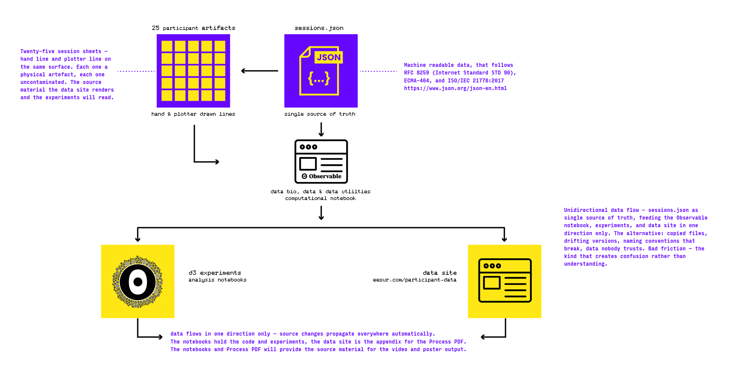
unidirectional data flow
If a session JSON is corrected — a spelling fixed, an observation expanded, a slider position clarified — the correction propagates automatically to every notebook, every visualisation, every representation. Nothing is frozen. Nothing drifts. The representation is always bound to the data.
The alternative: copied files, drifting versions, naming conventions that break, data nobody trusts. Bad friction — the kind that creates confusion rather than understanding.
amplify(data, representation) → trustworthy flow
The protocol
The session has a shape before it begins. There is a moment to settle, the studio introduced before anything is explained — two stations, two roles. The participant reads the session guide at their own pace. The guide is the threshold between arriving and starting.
01
The grid
Before anything is asked of the participant, the plotter draws the grid. Nine axes appear on the paper while the participant watches. The machine goes first. The participant's mark will be a response to something already present, not a mark made in empty space.
02
The draw
The participant draws one continuous line with their non-dominant hand across all nine axes — no lifting the pen, no going back. They choose any colour except black, which is reserved for the machine. The non-dominant hand removes the editing layer. What it produces is closer to what you actually know than what you think you know.3
03
The sliders
The participant moves to the laptop. Nine sliders, one per axis. Each slider runs between two named poles. Setting a position from memory and felt sense — no reference to the drawn line. The line has been left at the plotter bed. The sliders ask for the same knowledge through a different instrument.
Draw first, then sliders. The pilot confirmed what happens when it runs the other way — the participant begins optimising the line rather than responding from felt sense. The sequence is the method.
04
The plotter responds
The notebook generates a path from the slider positions. The AxiDraw plots it in black over the participant's marks. Two interpolations now on one sheet. The moment the machine finishes is the moment the research becomes visible.
05
The comparison
With both lines on the sheet, the participant reflects on what they are looking at. Four written questions. Which line is more authentic to your stance? The gap between the two lines is the data.
The nine axes
The nine axes are not categories or scales. They are a map of practice territory — the positions a practitioner holds, often without ever being asked to name them. Each axis runs between two poles. Neither pole is correct. The centre is a valid position. Undecided is data too.
I drew on questions I'd been asking myself for a long time — about how I work, where I tend to sit, what I keep returning to. The axes came from practice, not theory. That's why they feel like territory rather than a test.
Before the participant draws, they read the nine axes. They do not position themselves yet — they simply read. When they draw their continuous line across all nine axes, they are placing their whole practice on a single sheet of paper, in one unbroken movement, with their non-dominant hand. Any practitioner can draw their line.
01MakingReflecting
02SlowFast
03AloneTogether
04HandAutomation
05ConstraintFreedom
06TacitExplicit
07RepeatVary
08AnalogueDigital
09DepthBreadth
Tacit ↔ Explicit sits quietly in the middle of the list. It is doing the most theoretical work. The hand-drawn line is tacit knowledge made visible. The slider positions are an attempt to make it explicit. The machine then produces its own version of the explicit. The gap between all three is what the research is measuring.
The instrument
The session runs on an Observable notebook connected to an AxiDraw SE/A3 pen plotter. The notebook generates a polyline from the participant's nine slider positions and sends it to the plotter as SVG. The session data — slider values, written responses, character of the line — is exported as JSON after each session.
d3.interpolate(participant_positions, machine_path) → polyline on paper → gap between two ways of knowing
First names are used throughout. This is a deliberate choice — consistent with Giorgia Lupi's argument that data should retain its human origin.4 You remain a person who came to a house, chose a pen, drew a line.