Why it is built this way
The protocol wasn't designed in one sitting. Each structural decision was made in response to a problem the previous version had exposed. This page documents those decisions: not what the protocol does, but why it does it that way.
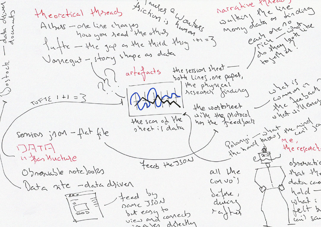
the thinking before the making
The full sessions — all twenty-five, with sheet scans, slider positions, and written responses — are in data.
The session sequence
The session begins with blank paper. The AxiDraw1 plots the nine-axis frame using a Pentel S570 fine point — the same pen the participant used to sign the participant information sheet. They watch it plot. The machine goes first, drawing the structure the participant will then mark against. Their line will be a response to something already present, not a mark made in empty space.
The participant then chooses a Sharpie — any colour except black, which is reserved for the machine. This connects to Molnár's2 use of selection as a meaningful act rather than a neutral administrative decision. The colour is documented alongside the artefact, not treated as noise.
The participant marks their position on each axis with the Sharpie — selecting a pole, placing a dot at felt intensity. This is their interpolation of their own practice. No machine output is visible yet.
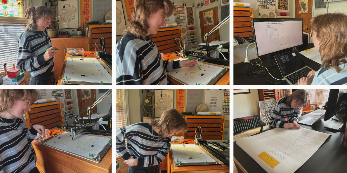
The participant then moves to the desk. The sheet stays on the plotter bed — out of sight. Using the same nine axes in the Observable notebook, they reconstruct their positions from memory and felt sense using sliders. The values can and do differ from where they drew. That divergence is part of the data. d33 generates the parallel coordinates path from the slider positions. The SVG4 exports. The AxiDraw plots the machine's version in black directly onto the participant's sheet — over their marks. Two interpolations on one piece of paper.
Written reflection follows: four short questions, handwritten with the Pentel S570 on the same sheet rotated broadside. The questions don't ask whether they wanted to start again, or how the session felt — they ask what the participant was following, where the two lines diverge, which feels more authentic. The language that matters emerges when the frame is narrow enough to let it.
The non-dominant hand
The non-dominant hand wasn't chosen for difficulty. It was chosen for honesty. Betty Edwards, Tim Ingold, Henri Chopin, Antonio Strati, Michael Polanyi — five independent frameworks all pointing at the same constraint: the non-dominant hand bypasses the editing layer.5 What it produces is closer to what the participant actually knows than what they think they know.
The order is the method: the participant draws first, then reconstructs from memory using the sliders. Never the other way.
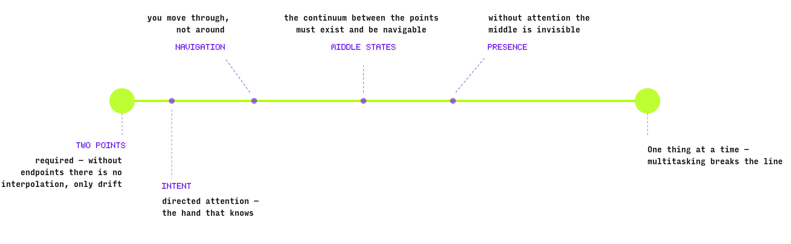
Each axis is its own interpolation — two fixed poles, everything between them navigable. The mid-points on the diagram are illustrative, not fixed. You could mark two positions or twenty. What matters is that you move through the middle, present for each decision. That's what the non-dominant hand protects: the presence, not the precision.
How it evolved
The session needed a structure for the participant to mark against — nine positions on a practice spectrum, drawn by hand in a single continuous line. Getting that structure right took several iterations.
The first attempt was a radar chart. That week I happened to be working through The Artist's Way — Julia Cameron's twelve-week programme6 — and the life pie at its centre is a radar: twelve areas of life scored 1–10, plotted as a web. The problem is structural. On a radar, zero sits at the centre and ten at the rim. Low scores collapse inward — they read as deficit, as though being closer to making than reflecting is a failure. That's the wrong question. No position on any axis is wrong. Even the centre is a stance.
Parallel coordinates resolve it. Each axis is a horizontal line. Both poles carry equal weight. The participant declares a direction, not a score.7
The first version used two sheets — one for drawing, one for the plotter output. Two objects means comparison requires holding both in view simultaneously. One sheet with both interpolations makes the gap immediately visible. The comparison is built into the artefact.
The nine axes follow the same logic as the manifesto at eesur.com — this over that. Not better or worse. A position. A stance. The three research-critical axes — Slow/Fast, Hand/Automation, Tacit/Explicit — are distributed rather than clustered, so the line has room to move interestingly between them.
Before running any sessions I ran a pilot — with Muskeen, my daughter, aged 24, MA in Data Visualisation from UAL. She's not a neutral participant: she knows the domain, the researcher, the house. That makes her the right person to break the session and the wrong person to generate primary data.
Her written response to question one — When you drew the line, what were you following?:
"When hand drawn I was following my feeling more, and the flow of drawing and I was thinking about it more individually for each point as 'high' or 'low'."
And her debrief summary, unprompted:
"One feels like instinct. The other feels like adjusting."
The participant sheet
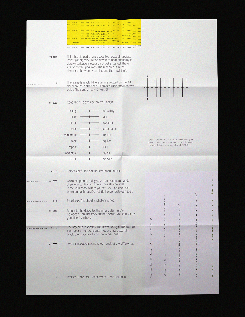
The session guide is a square — 594 × 594mm, printed on the Epson SC-T3100. The size wasn't planned. It emerged from asking what the printer could do and what the session needed. Large enough to be taken seriously before a mark is made. The sheet accumulates through use: written responses in the rotated columns, observation notes after they leave. Nothing is pre-filled.
The four questions are set broadside — the participant physically rotates the sheet to write. After moving between plotter and desk, after drawing and reconstructing through sliders, the final act is one more transition. The body reorienting. It fits the sequence without being designed to. The Epson and the AxiDraw are both plotters — both translate instructions into marks. The instrument and the artefact share a lineage.
the session sheet — questions and steps
The observable notebook and SVG mapping
The session runs from a custom-built Observable notebook — nine neutral sliders, one per axis, generating the machine's parallel coordinates path in real time. The sliders are designed to declare a position rather than score a value: no directional fill, no numeric readout, pole names at each end. The notebook exports two files per session: an SVG for the AxiDraw and a JSON for the record. The JSON wasn't planned in advance — it emerged from asking the next question before the current one was finished. If I run ten sessions, how do I compare them?

registration confirmed
The machine had to land exactly on the participant's marks. Not approximately — exactly. The coordinate systems of Inkscape and the AxiDraw don't automatically agree. Understanding why, and resolving it, meant reading the transform matrix applied to every layer group in the template file: multiply by scale, add translation, resolve to world coordinates. All nine axis positions extracted this way, hard-coded as named constants.8 That wasn't peripheral technical work. It was where the two tools learned to share the same physical space. The first plot confirmed it. The machine's polyline landed exactly on the frame.
interpolation-collab notebook ↗The sessions run
Twenty-five sessions across twelve weeks. The first four — Ju-Eun, Oliver, Michael, Andy — on Saturday 14 March. None of them knew what the research was before they walked in. Every one of them expressed it — in their own words, in their own way — during the session.
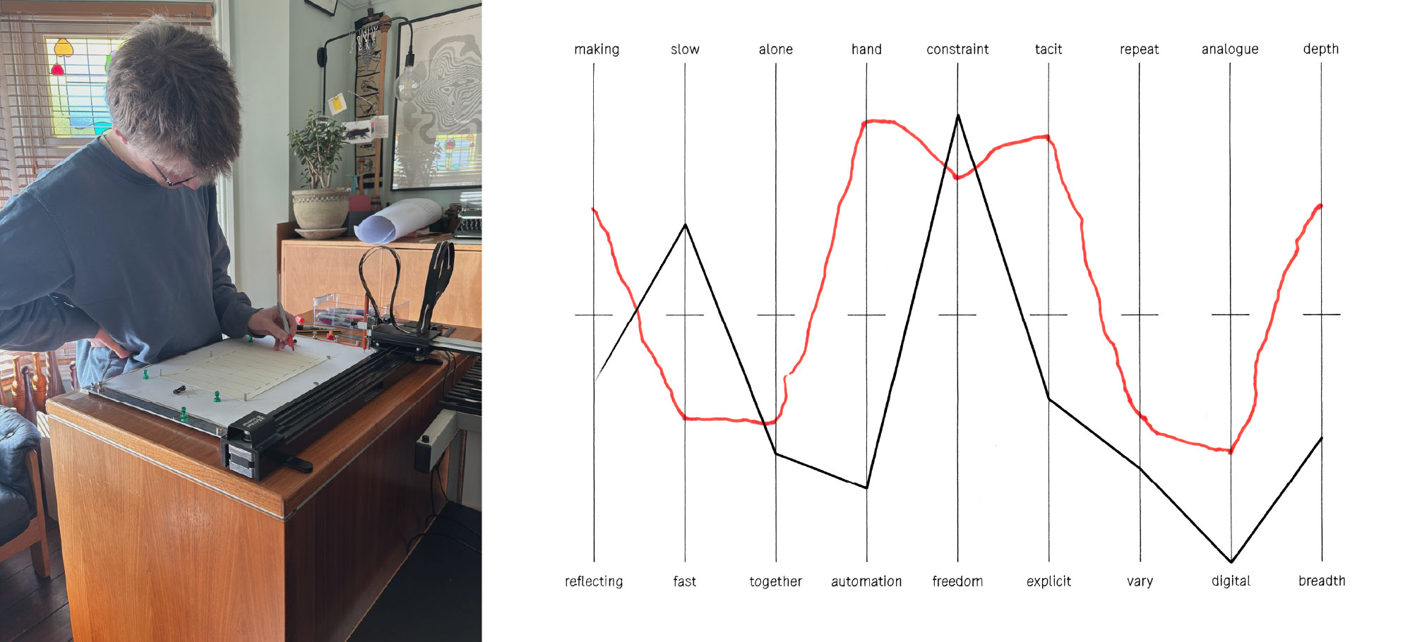
Oliver found the sliders sterile, clinical — they cared more about his result than his experience. Michael drew with confidence and a deep pull toward tacit; after the session we stood in front of the Albers linoprint on my wall and talked about colour, interpolation, the Munsell hue test. He said: even my maths is tacit — in fact most things I do are tacit. Andy used his whole body — not his arm, his whole body moved the pen. A long pause before he started, then a smooth continuous line. Afterwards he talked about the dash — not the gravestone dates, but the dash between them. The life lived in the middle.9
Oliver's sheet
The room was doing work before the sessions began. Brian Eno's Music for Airports playing. Albers on the wall. The book collection downstairs while participants waited.
Five participants came on 21 March — Emlie in the morning, Lucy, Rosie, Jacob and Ahalya in the afternoon. It was only after the sessions closed that the pattern became visible: all five have a background in fine art. This wasn't designed. It emerged.
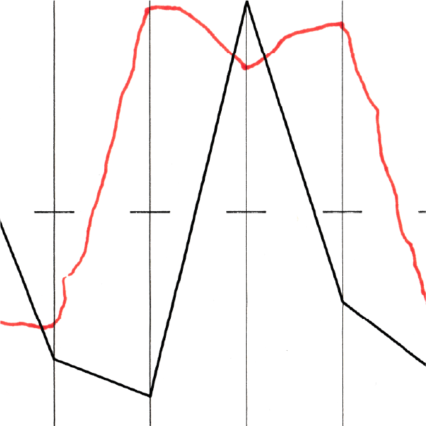
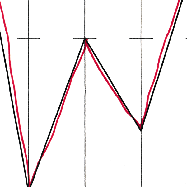
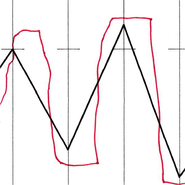
Emlie's line swings dramatically between extremes — energetic and decisive. Lucy's wanders, feeling its way, and every time she paused she hummed, not consciously, not performed, the pen and the voice connected in a way she wasn't aware of. Jacob's line drifts and bends, reading space rather than committing to position. Ahalya's jumps to extremes with confidence. Four practitioners. Four completely different lines.
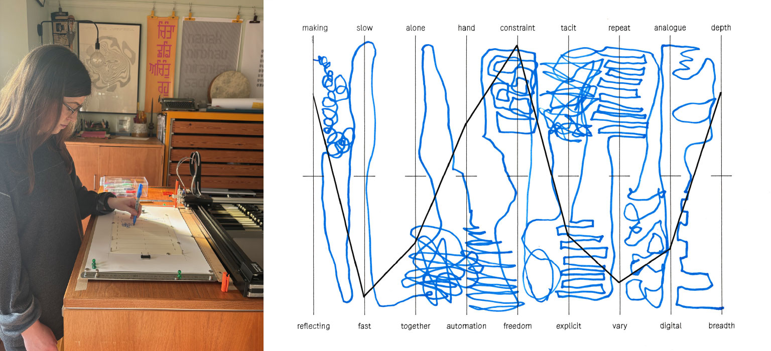
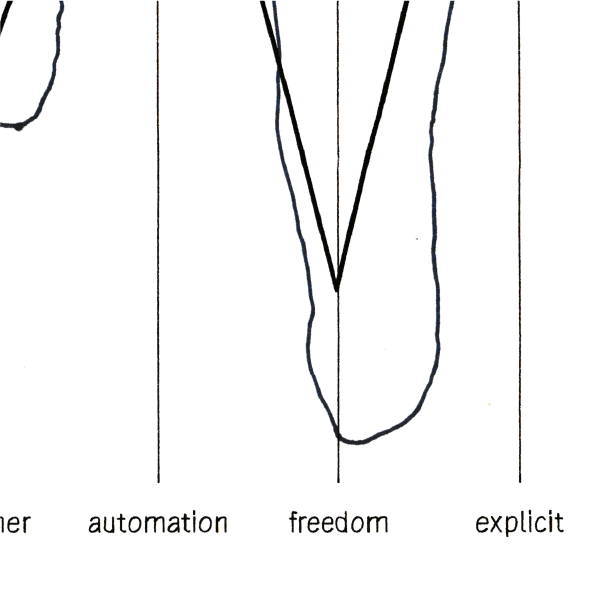
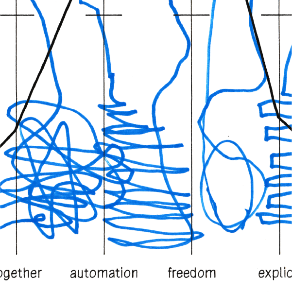
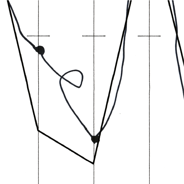
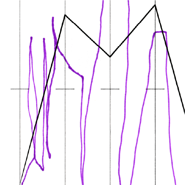
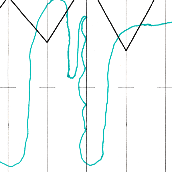
And then Rosie went somewhere else entirely. Not across the axes but through them — filling, revisiting, looping back. What appeared on the sheet wasn't a line in any sense the protocol had been working with. It was a field. A territory. Each axis became a space to inhabit rather than a position to mark. Rosie took interpolation — the movement between two states — and refused to let it resolve. This is what d3.interpolate cannot do: it will always produce a value between two endpoints, always move toward resolution. Her hand produced something the machine has no equivalent for. The gap between her line and the machine's isn't a measurement of divergence — it's a different understanding of what a line is for.
Rosie's sheet
I know visual grammar. I've read Kandinsky, Wilkinson, Legér. I understand point, line, plane, figure, ground, tension, interval. None of it prepares you for watching someone draw. The intensity, the hesitation, the presence — I don't have words for that and I'm not sure words are the right tool.
The more I look at them the more I love them. They are my visuals and they are not — I didn't make these marks. That paradox is the point. They are better than anything else in this project.
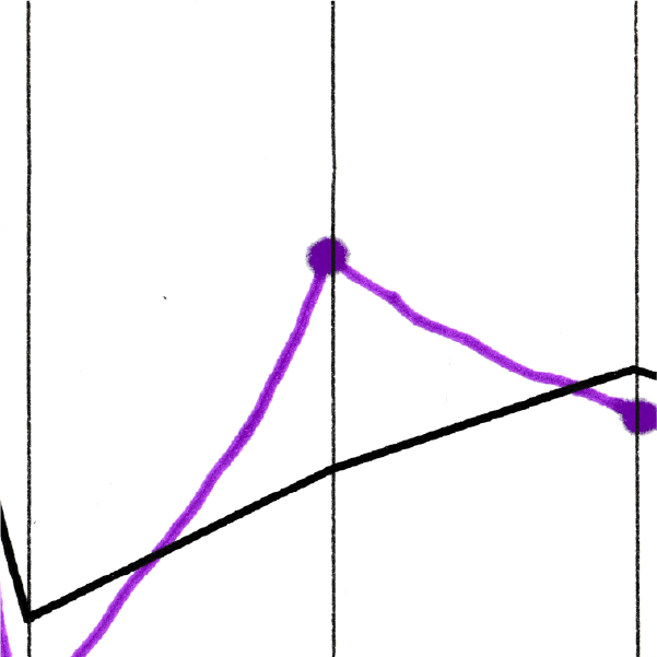
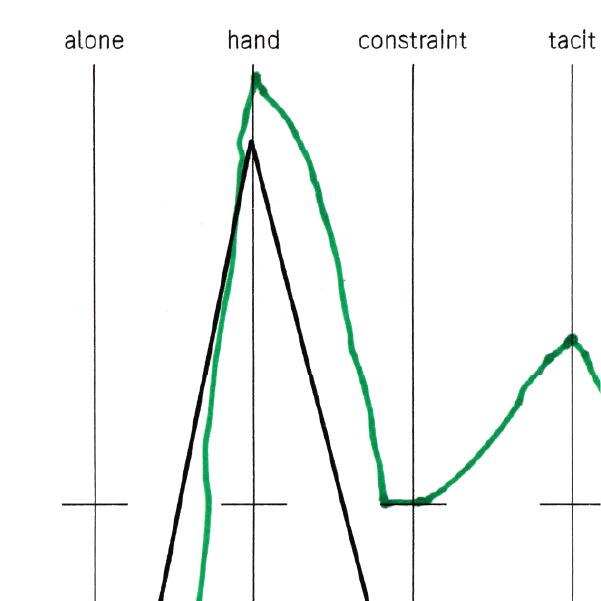
These are snippets — the researcher's eye on selected sheets. Not the square system analysis, not the slider values, but what the scans hold that the data infrastructure cannot: the full character of the mark, the space filled rather than crossed, the texture of the line across its length.
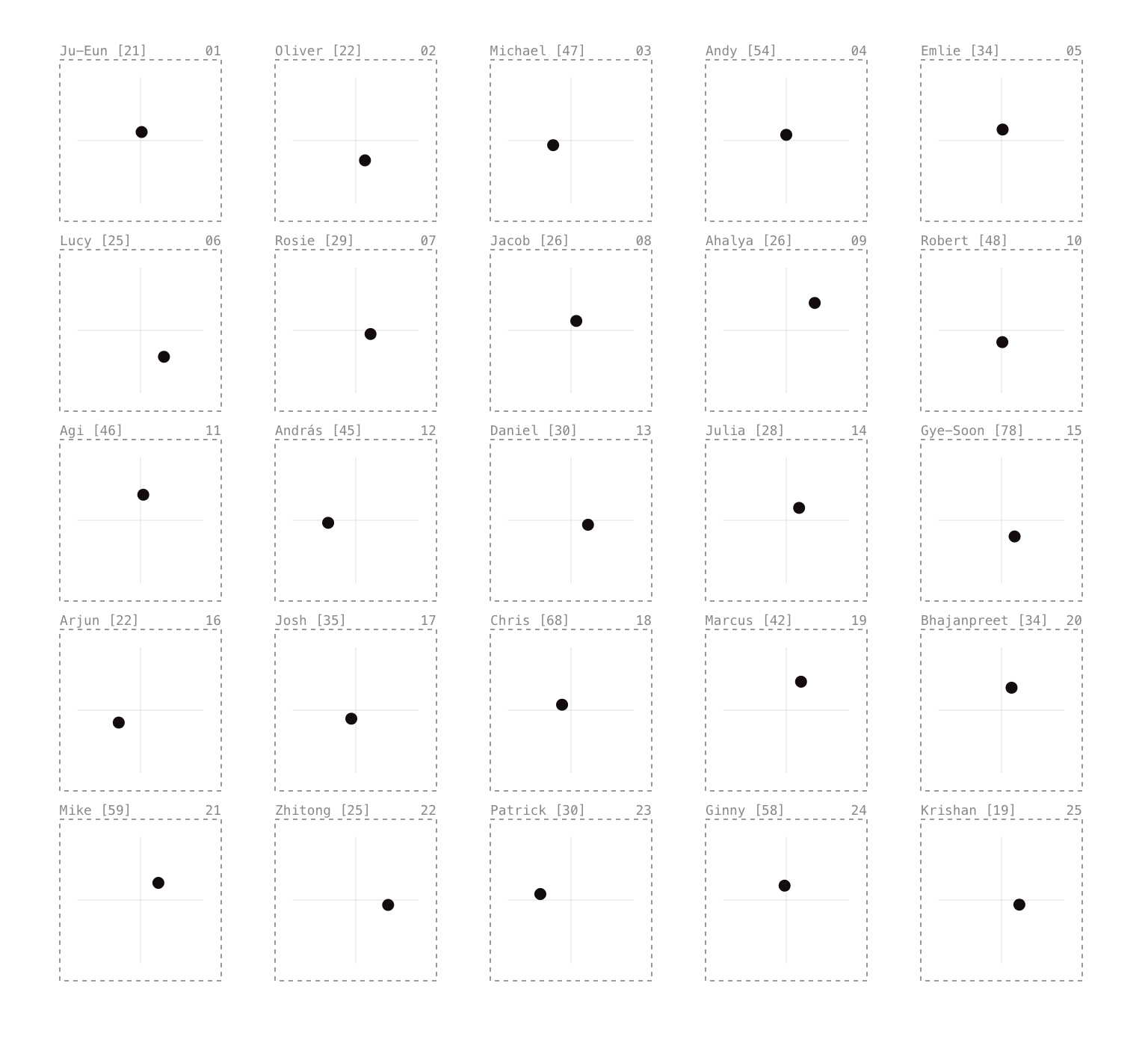
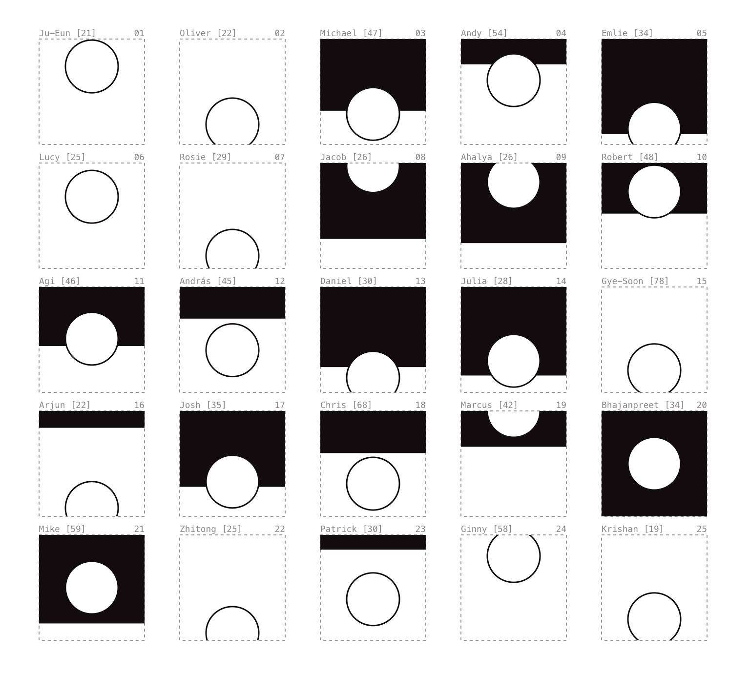
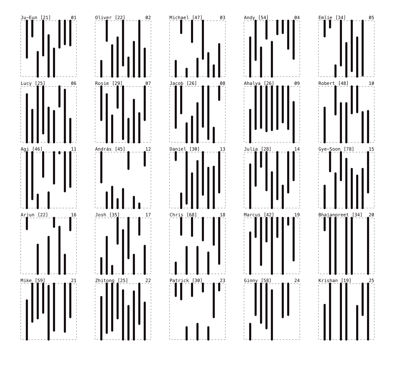
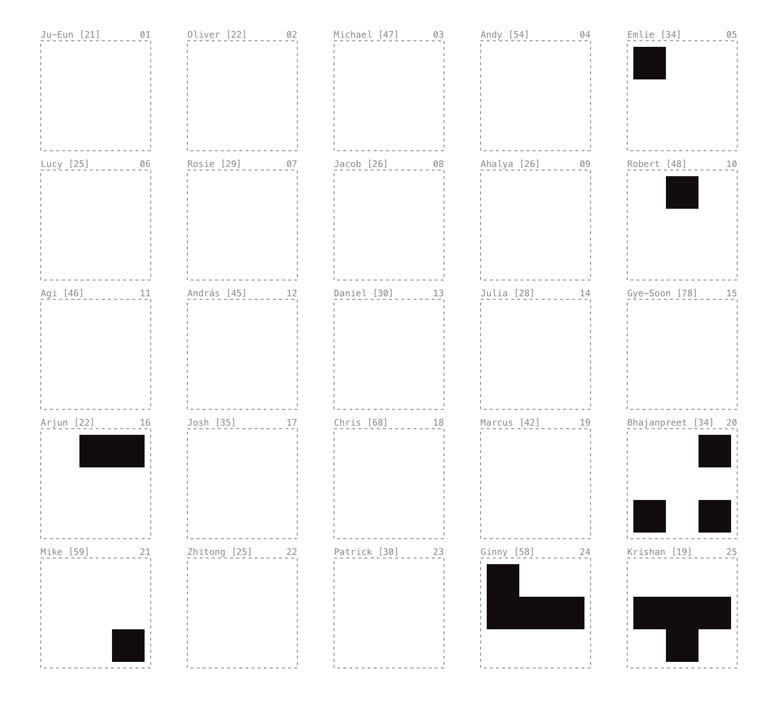
The square system
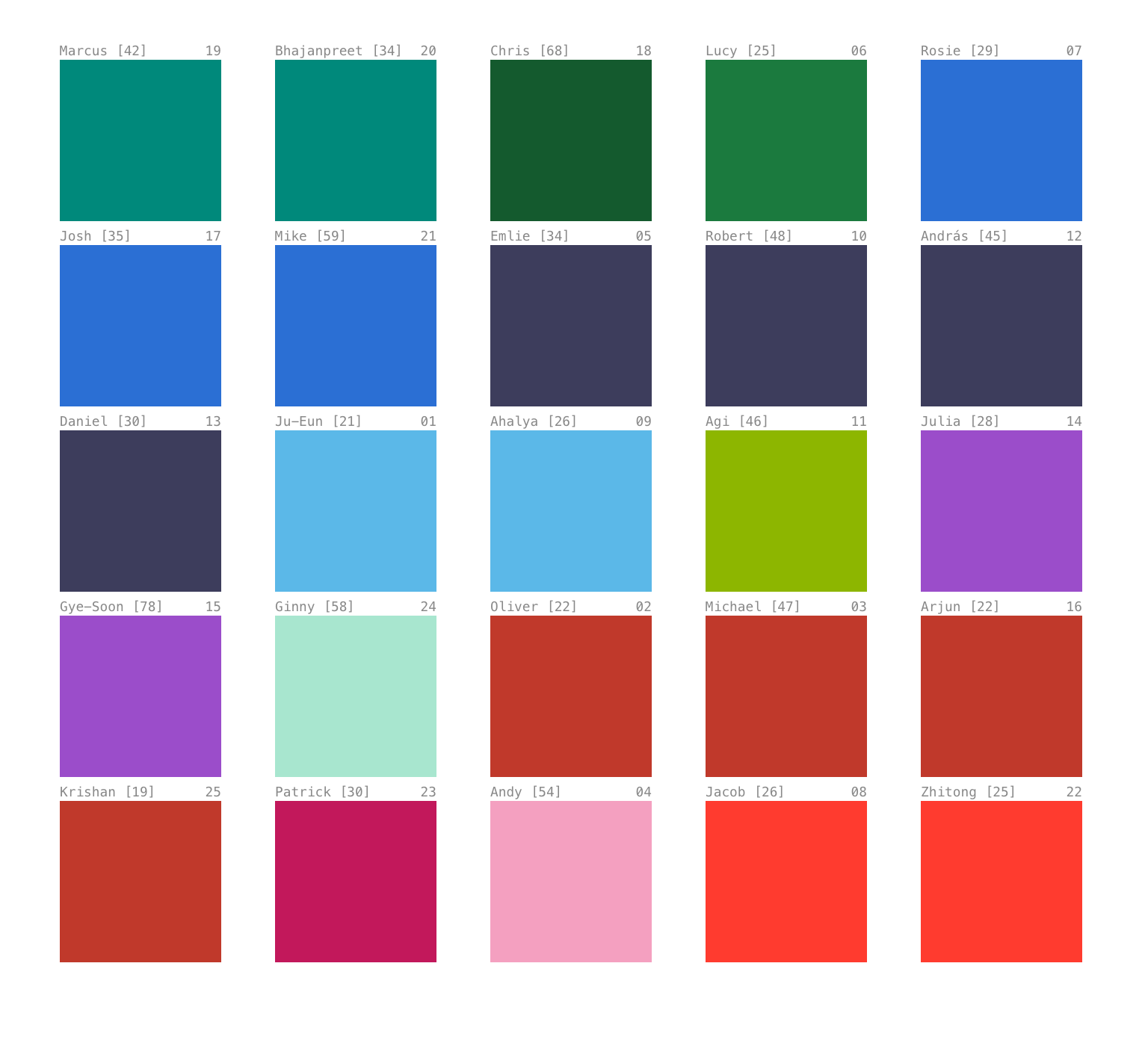
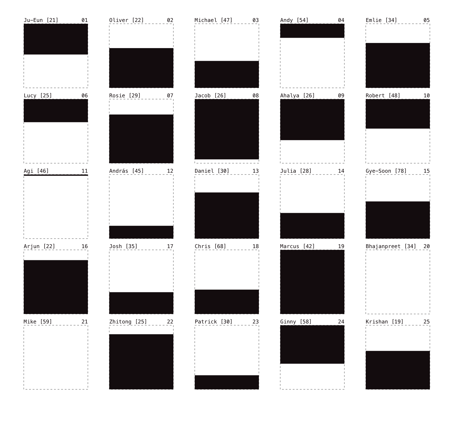
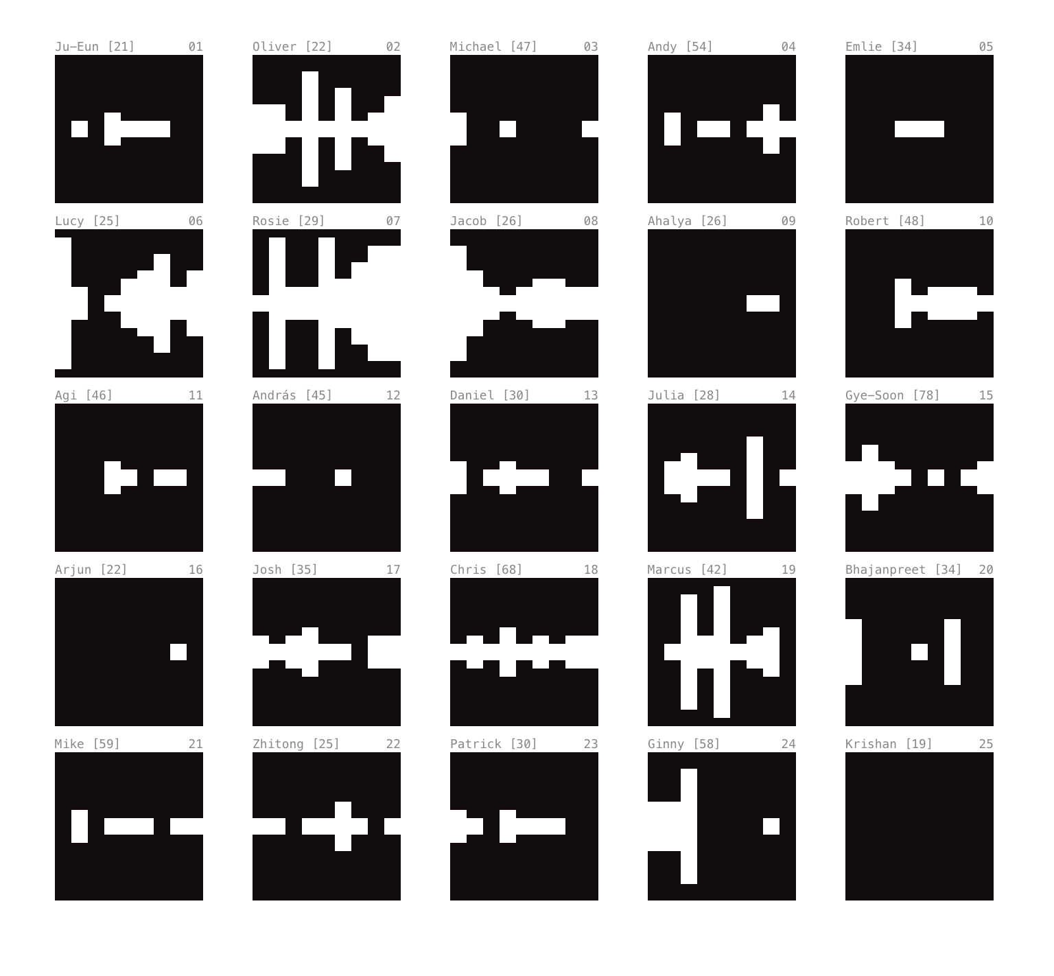
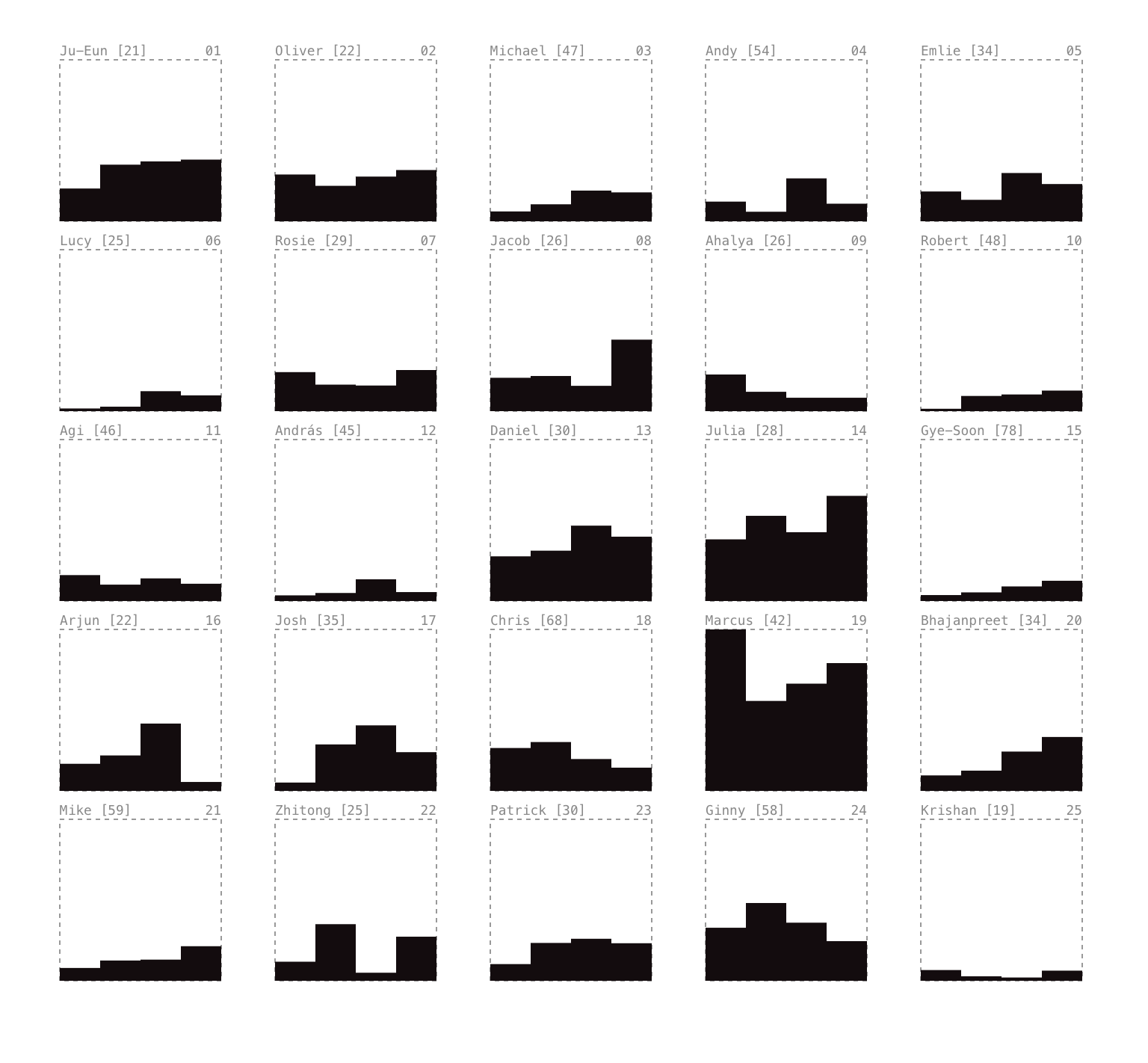
Once all twenty-five sessions were complete, the analysis moved into Observable. Eight notebooks, one visual grammar — each one asking a different question of the same dataset. The grammar came from Đorđević's Processes in a Square System (1975), found in the CSM library after the visual language had already taken its form. The coincidence felt like confirmation rather than discovery.
The visual system was designed specifically for this data. Twenty-five squares, one per participant, each one a 5×5 field. The notebooks are not a summary of the sessions — they are a different instrument applied to the same source. Each one makes something visible that the others don't.
Language and analysis
Two Observable notebooks sit alongside the visual analysis as analytical tools — a shift in method from making marks visible to making language visible.
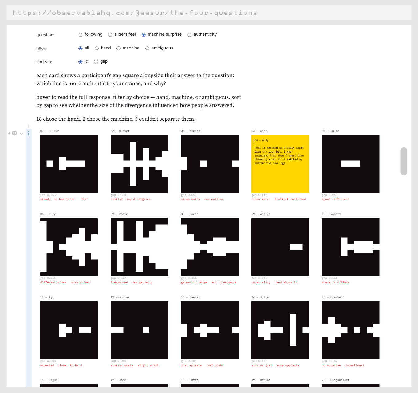
The four questions takes the authenticity response from all 25 participants, distils each to a single sentence and a choice using an LLM, and maps the outputs directly onto the gap squares. The visual and the verbal sit together for the first time. 18 chose the hand. 2 chose the machine. 5 couldn't separate them.
"The machine in a way strips the human aspect of drawing, you follow a visual journey with the drawn line, and you can see when I stopped for a few seconds to think."
"Its straight lines and sharp angles seem to express a clarity, confidence and certainty that was certainly not present as I was feeling my way to my answers."
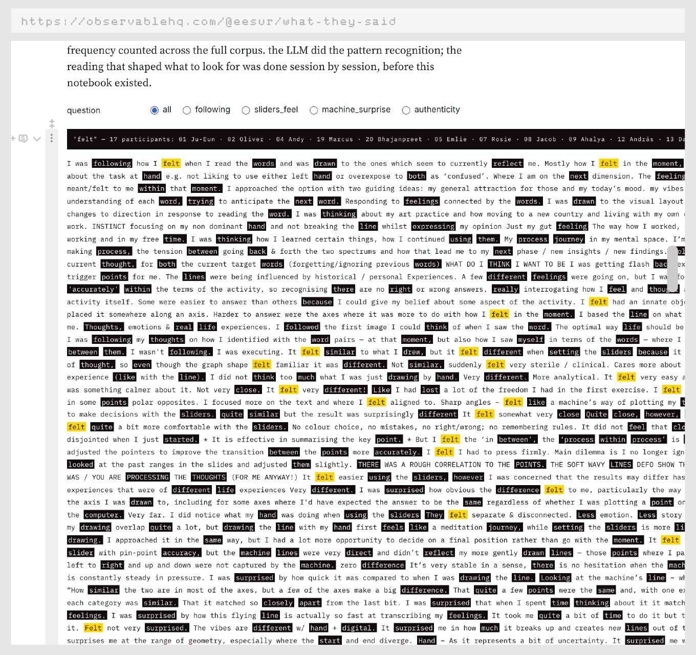
What they said runs all four written responses as a single body of text. Shared words — stems appearing across three or more participants — are marked in black. Hover to see who used that word and in which questions it appears. The LLM did the pattern recognition; the reading that shaped what to look for was done session by session, before either notebook existed.
"The hand drawn line is a meditation journey, while setting the sliders is more like a quick summary of my drawing."
These two notebooks were chosen over a more conventional thematic analysis. Seeing the connections in the data directly — the set together, the four questions as a corpus — felt more honest to the research method than summarising at one remove. The LLM used is Claude Sonnet (Anthropic), called via the API with prompts documented in the notebooks.